Glutone
UI/UX | performance
Home » Glutone

UI/UX | performance
Rebranding Beauty Industry Leader for the Future
Turning a high-traffic website into a reflection of Glutone’s true brand superiority was the key task. Despite being the most recommended dermatologist brand in India, Glutone’s digital presence needed a refresh to appeal to a younger audience while still catering to their long-standing customers.
Refining Glutone’s brand positioning to focus on results and credibility was essential. We modernized the tone and design, emphasizing the brand’s dermatologist-recommended status and creating a bridge between their heritage and future growth. The goal was to increase appeal to younger consumers without alienating loyal customers.
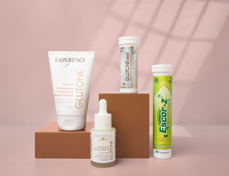
Photoshoot Guidelines: We developed detailed guidelines for all future photoshoots to maintain a consistent visual identity across the brand. This included defining lighting, angles, and color schemes to ensure every image aligns with Glutone’s new modern, premium aesthetic.
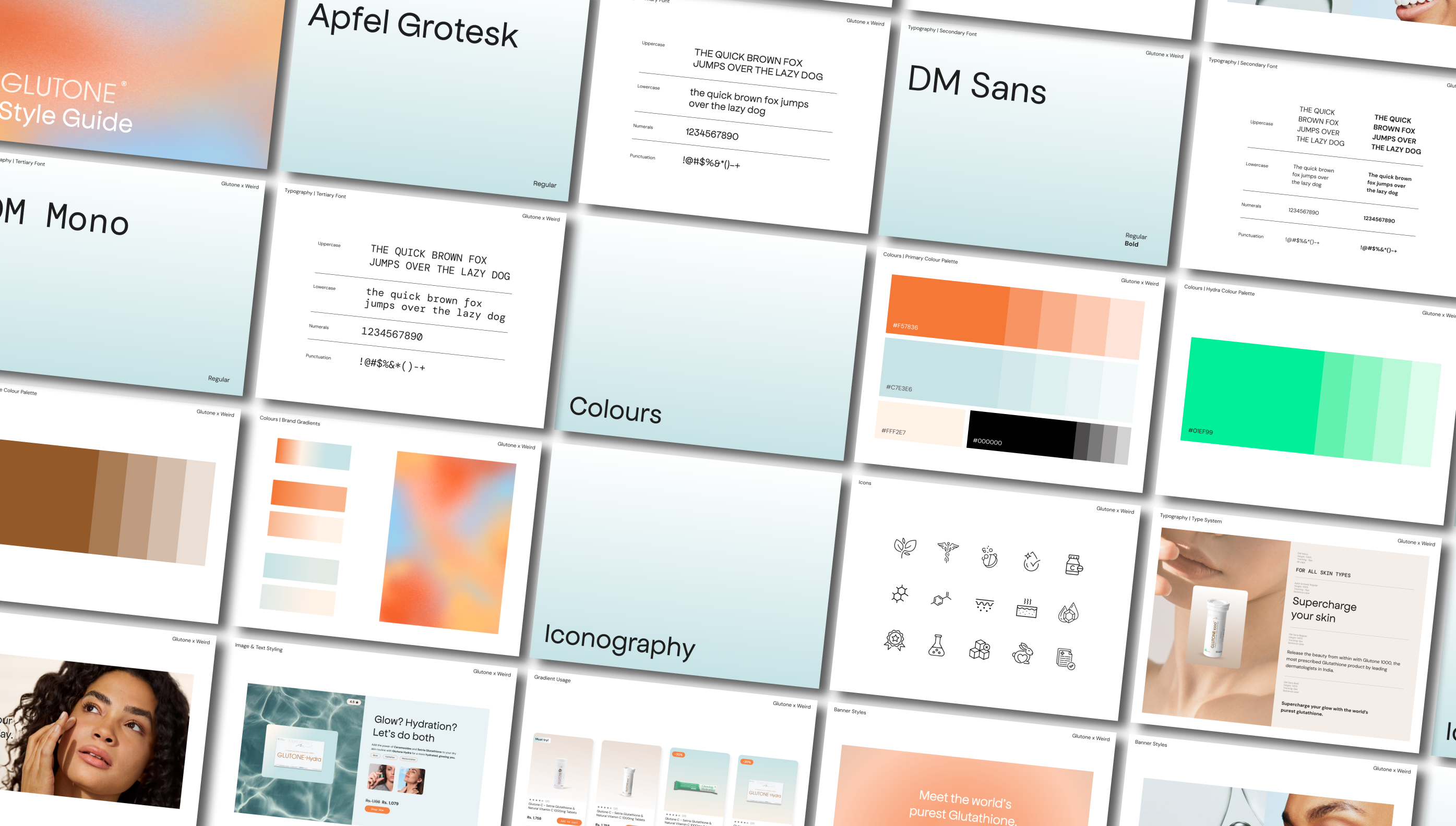
Color Palette: The new color palette was crafted to evoke a sense of wellness and luxury. We shifted to clean, light tones with pastel accents to create a soothing, health-conscious feel. Each color was carefully selected to work across digital and print, ensuring cohesive branding in every medium.
Typography: We introduced modern, elegant fonts that brought sophistication to the brand’s look. This update helped Glutone stand out visually, especially on product pages where readability and clarity were key. The font choice also aligned with the premium nature of the brand, while still feeling approachable.
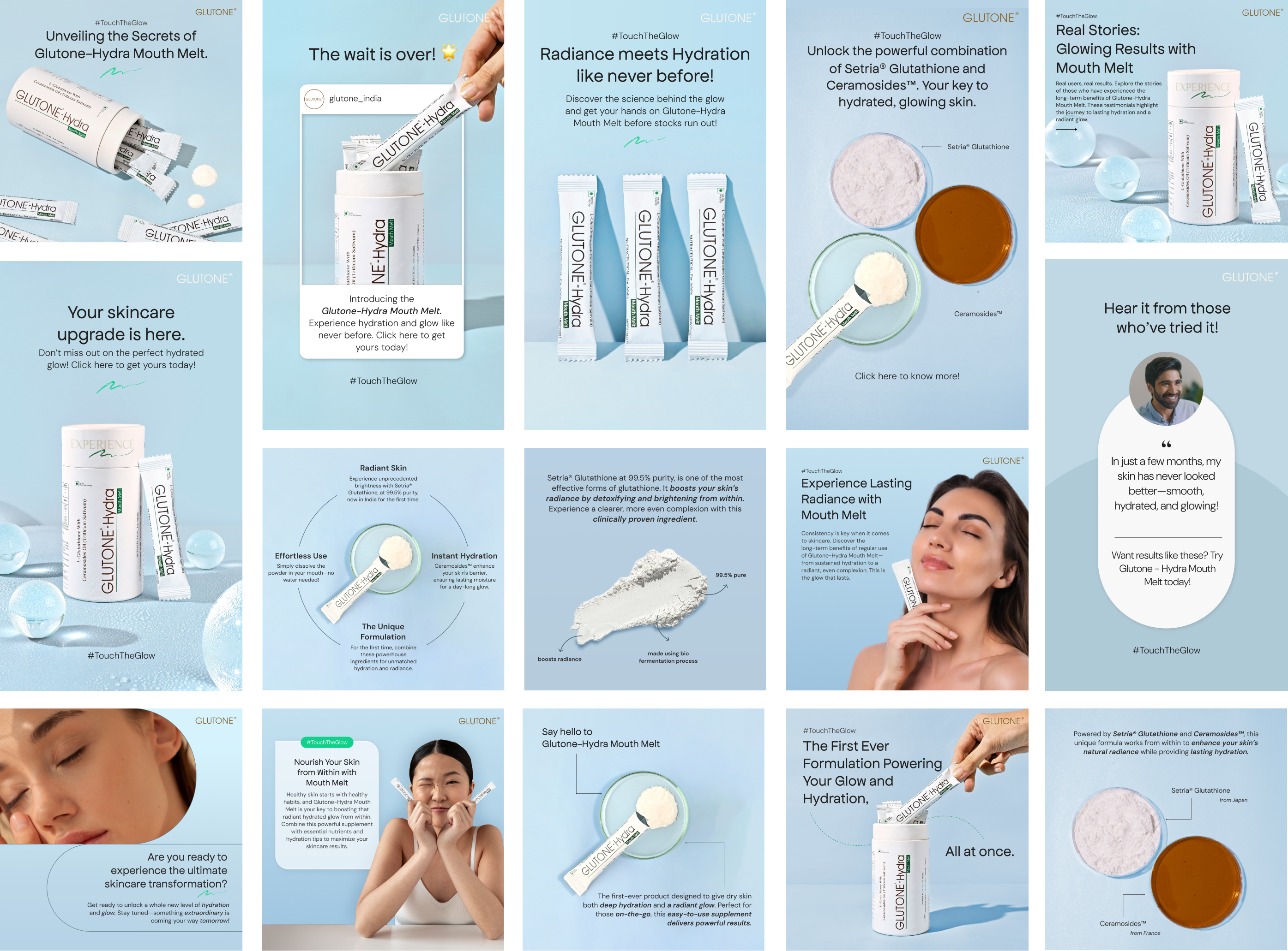
Copy Tone: The copy was rewritten to focus on simplicity and results. We crafted a tone that is professional but warm, using approachable language that clearly communicates product benefits. The aim was to make the messaging resonate with both a scientifically aware audience and everyday consumers who want clear, no-fuss information.
Design Concepts: We crafted a new, clean visual design language that mirrors Glutone’s premium position in the market. This included integrating more whitespace for a breathable, uncluttered feel, while using hero images and engaging product visuals to draw attention to key offerings. Each design decision reinforced the idea of simplicity, results, and quality.

We redesigned the website to be sleek, intuitive, and user-friendly. The new layout made product discovery seamless, with each page highlighting Glutone’s results-driven approach in a clear and engaging way. The site was designed to appeal to both loyal customers and new, younger audiences.

The new site led to a 3% increase in conversion rates. More importantly, it boosted sales of previously less popular products, with clearer positioning and a modern, engaging design.
